✢ 2024 ✢
Design
Portfolio
by
tomi oduwole
I'm currently a graphic Designer based in London with about a years worth of experience. My expertise expands over various areas including UX Design, Illustration and Artworking
About me
TOMI ODUWOLE
I have worked with on projects for clients such as JA Resort, Excel London, Twickenham and Arsenal. Due to NDA’s i am unable to share work that has been done until it is made public
I am passionate about all things art and design and have developed my proficiency in softwares such as Adobe Photoshop, Illustrator, InDesign, XD, Dimensions and Figma to ensure my skills stay up to date
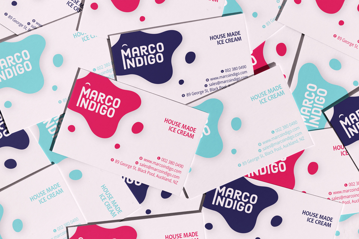
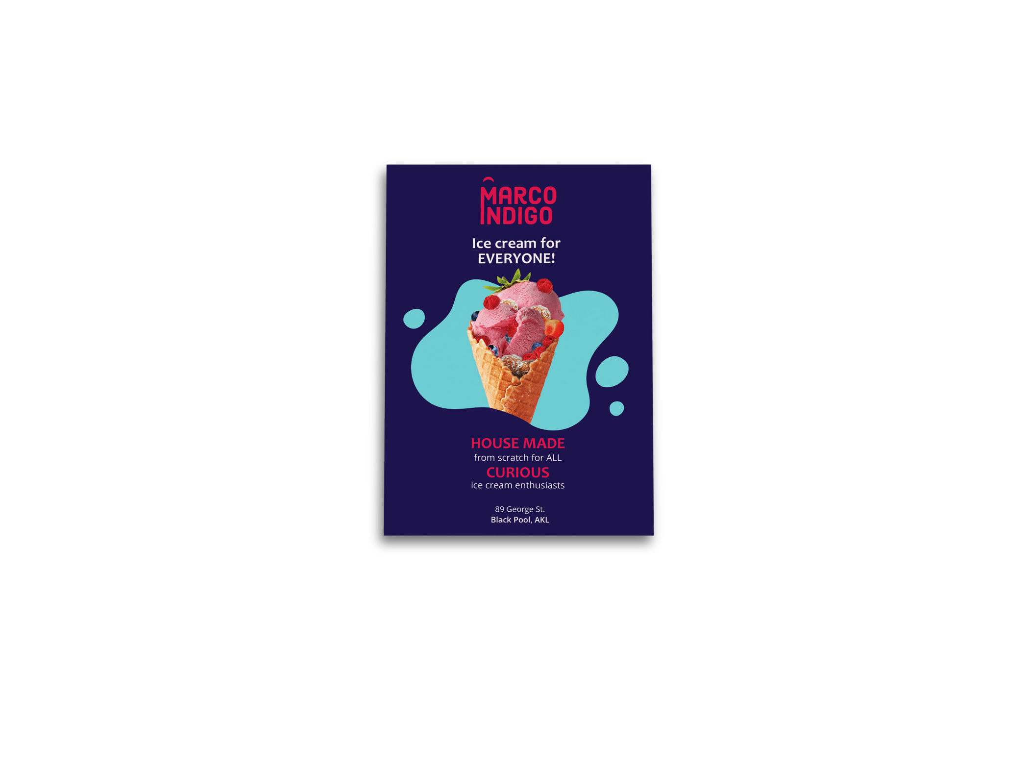
Marco Indigo
GRAPHIC Design & Artworking
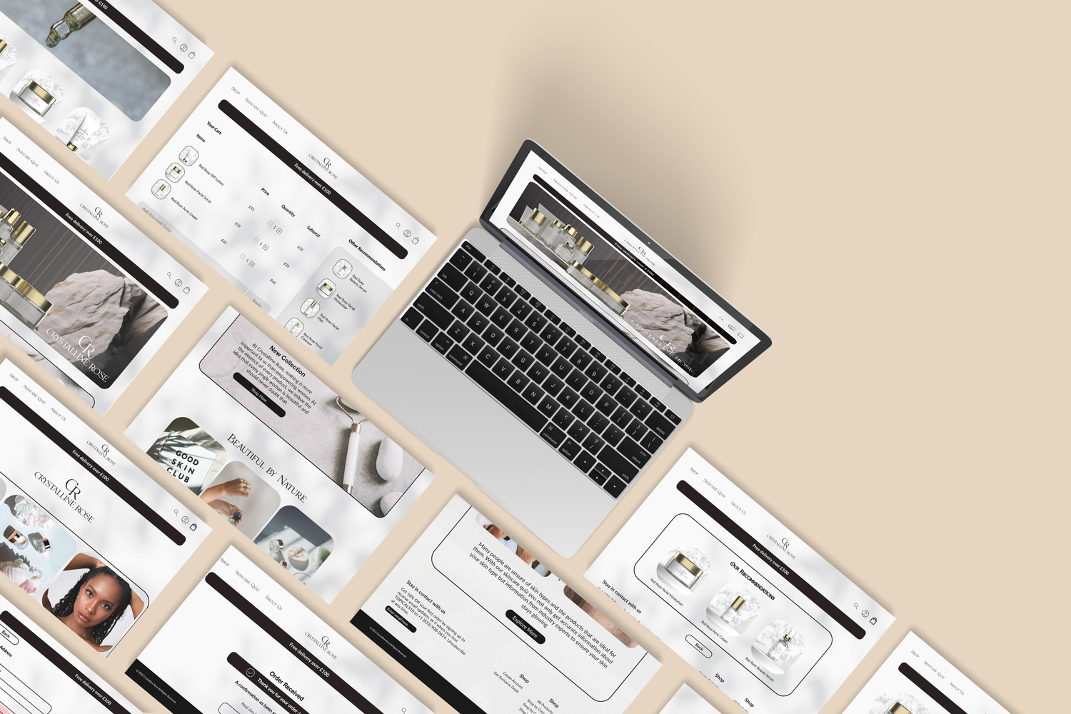
Responsive website for a luxurious women’s skincare brand. Key features include a skincare
quiz that will make product recommendations based on the results.
They wanted their brand to be feminine, soft, striking and luxurious.
They are an international beauty and cosmetics company that specializes in skincare product.
The brand's core values center around empowering women and challenging clichés and stereotypes in the beauty industry.
Project Details
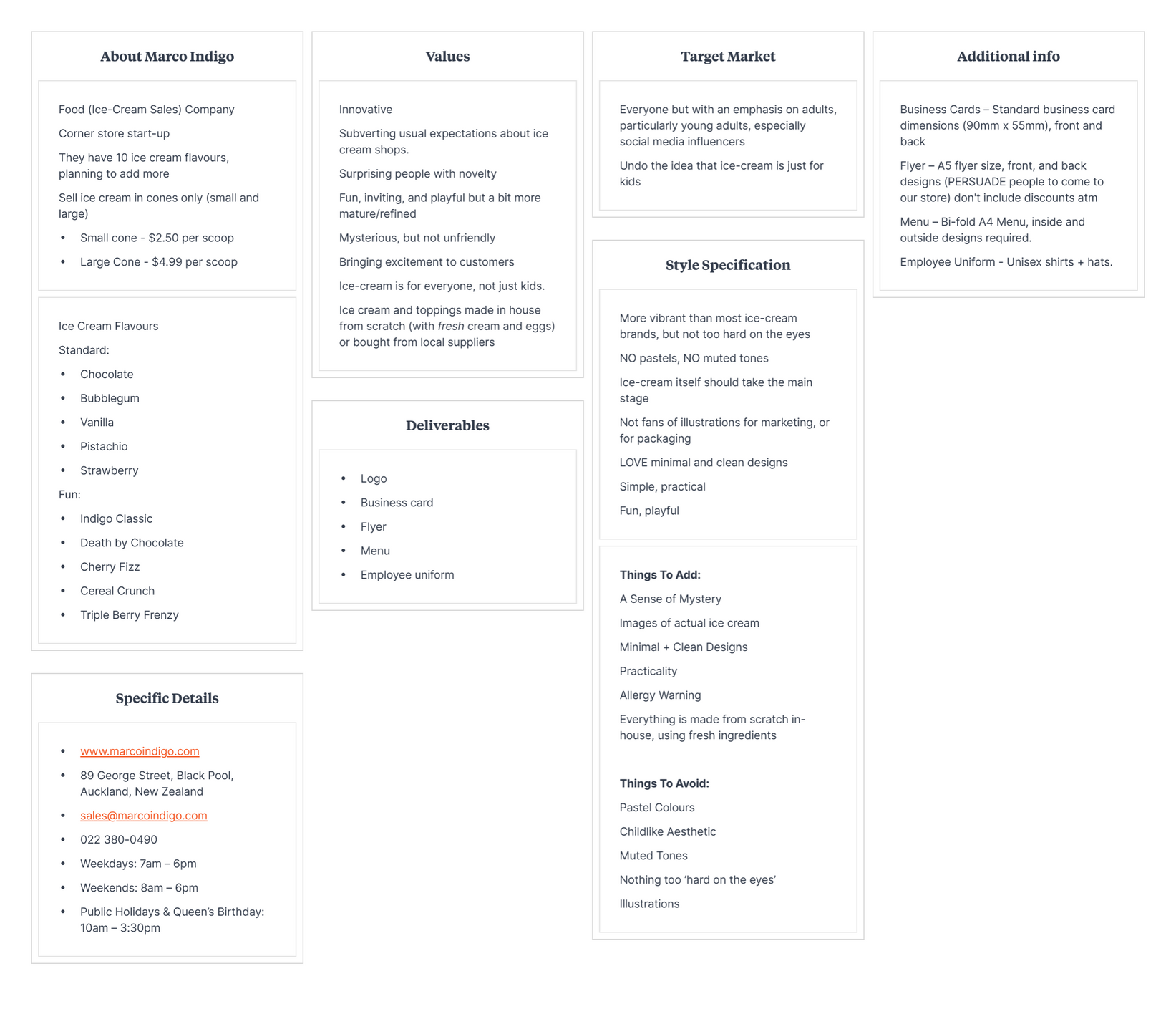


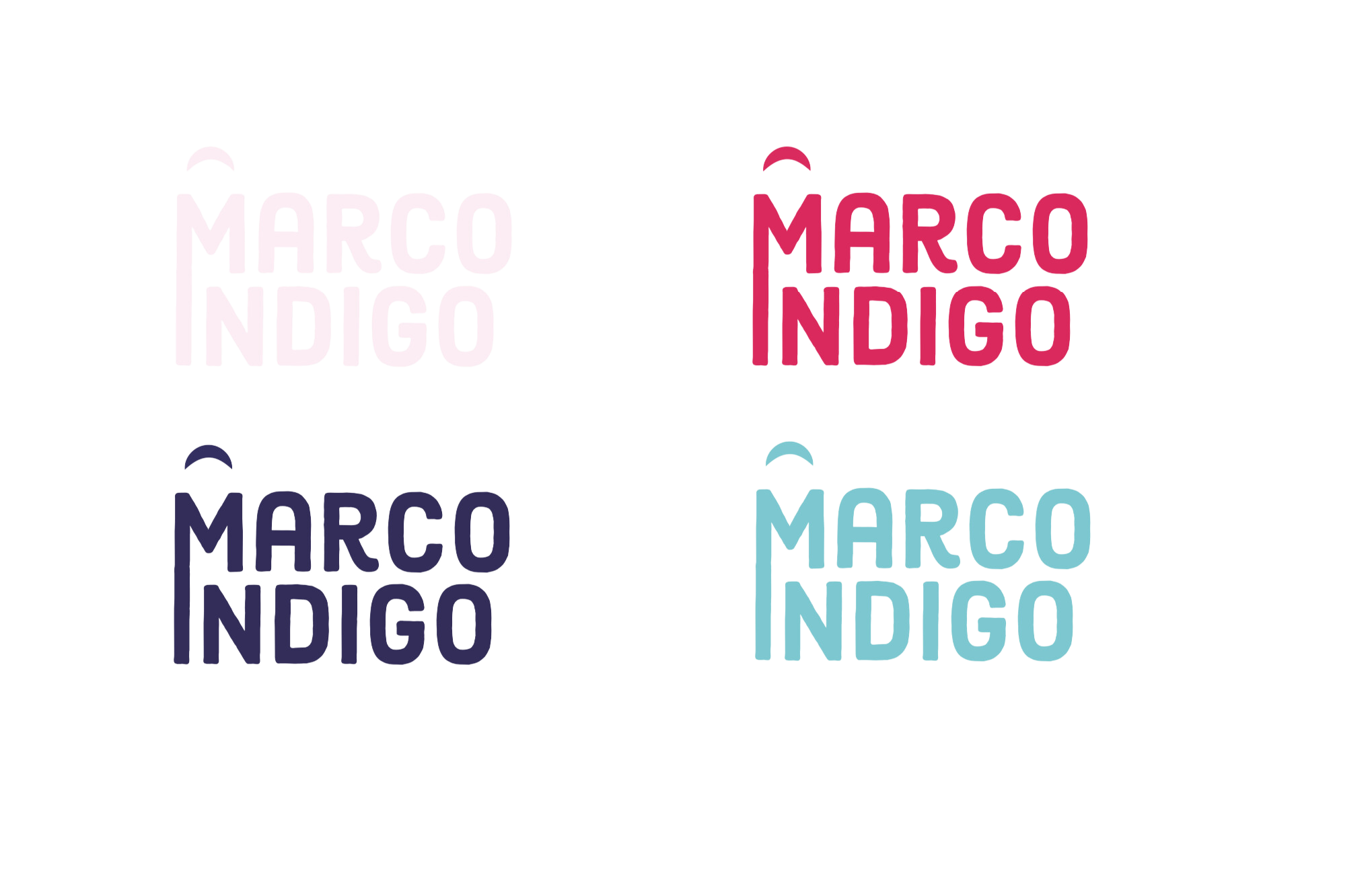
Logo Design
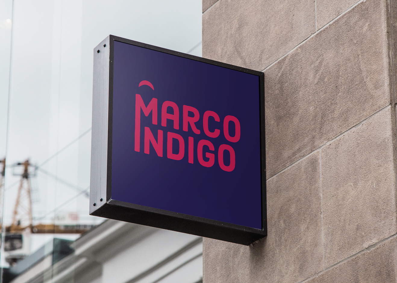
Sophisticated Logo design with cap on top of the M to mimic and ice cream cone

Business Card Design
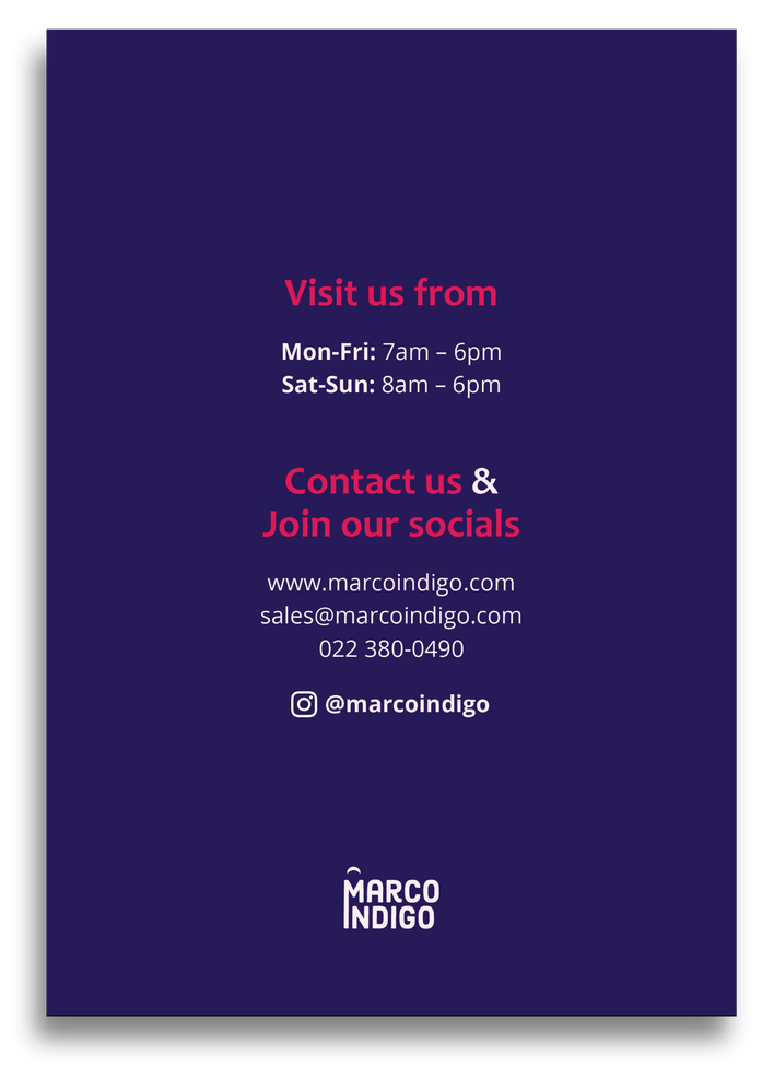
Flyer Design
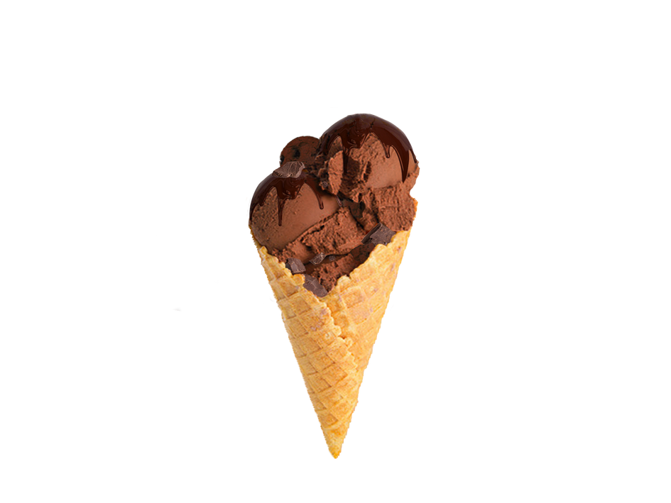
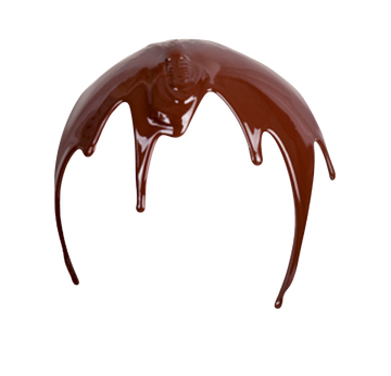
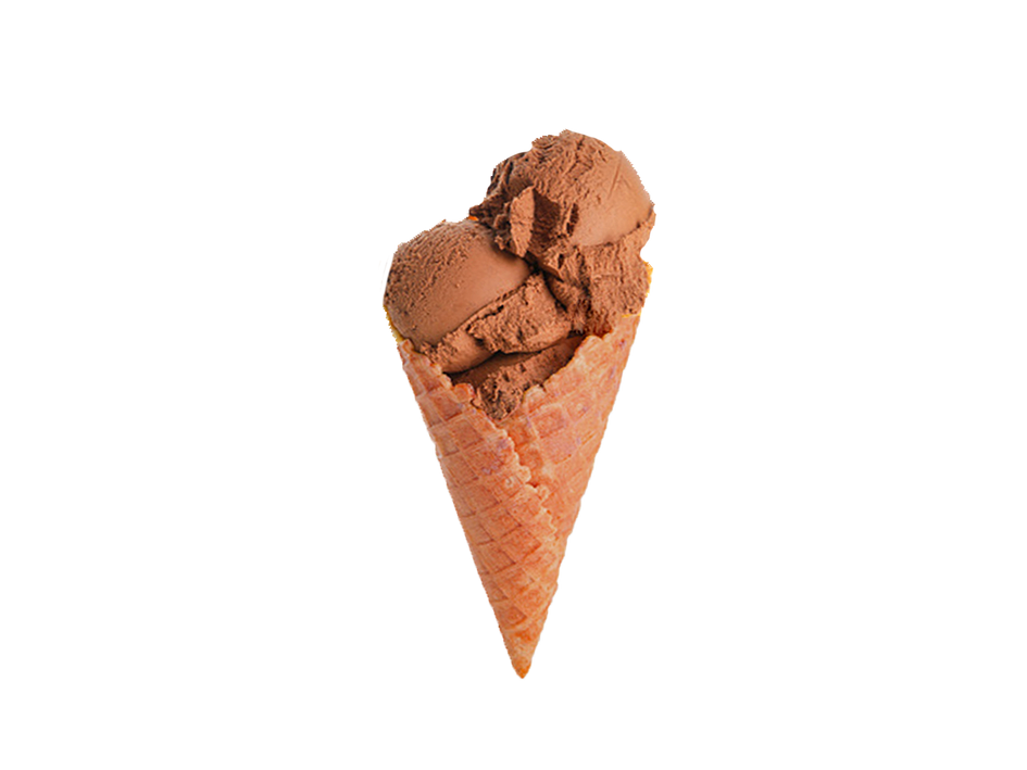
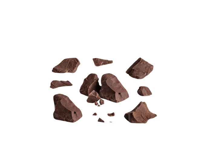
Death by Chocolate Ice Cream edit source images
+
=
Cereal Crunch Ice Cream edit source images
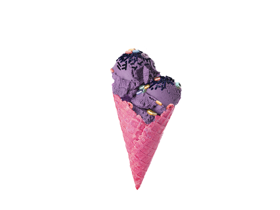

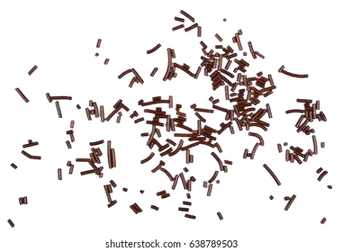
+
=
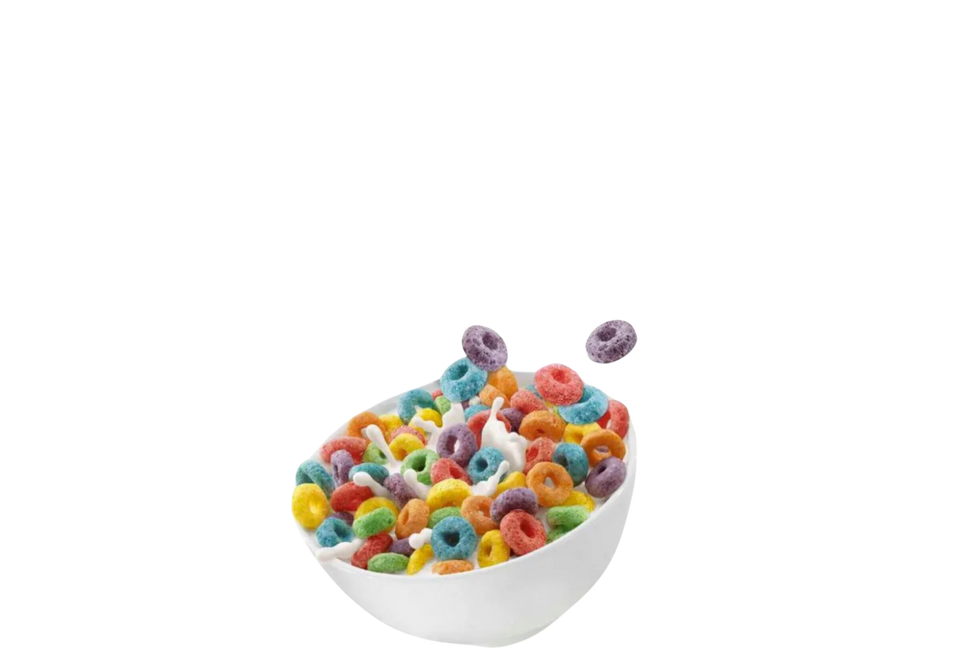
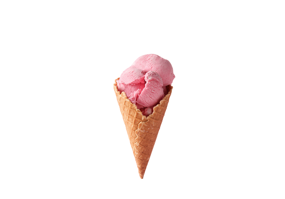
+
Cherry Fizz Ice Cream edit source images
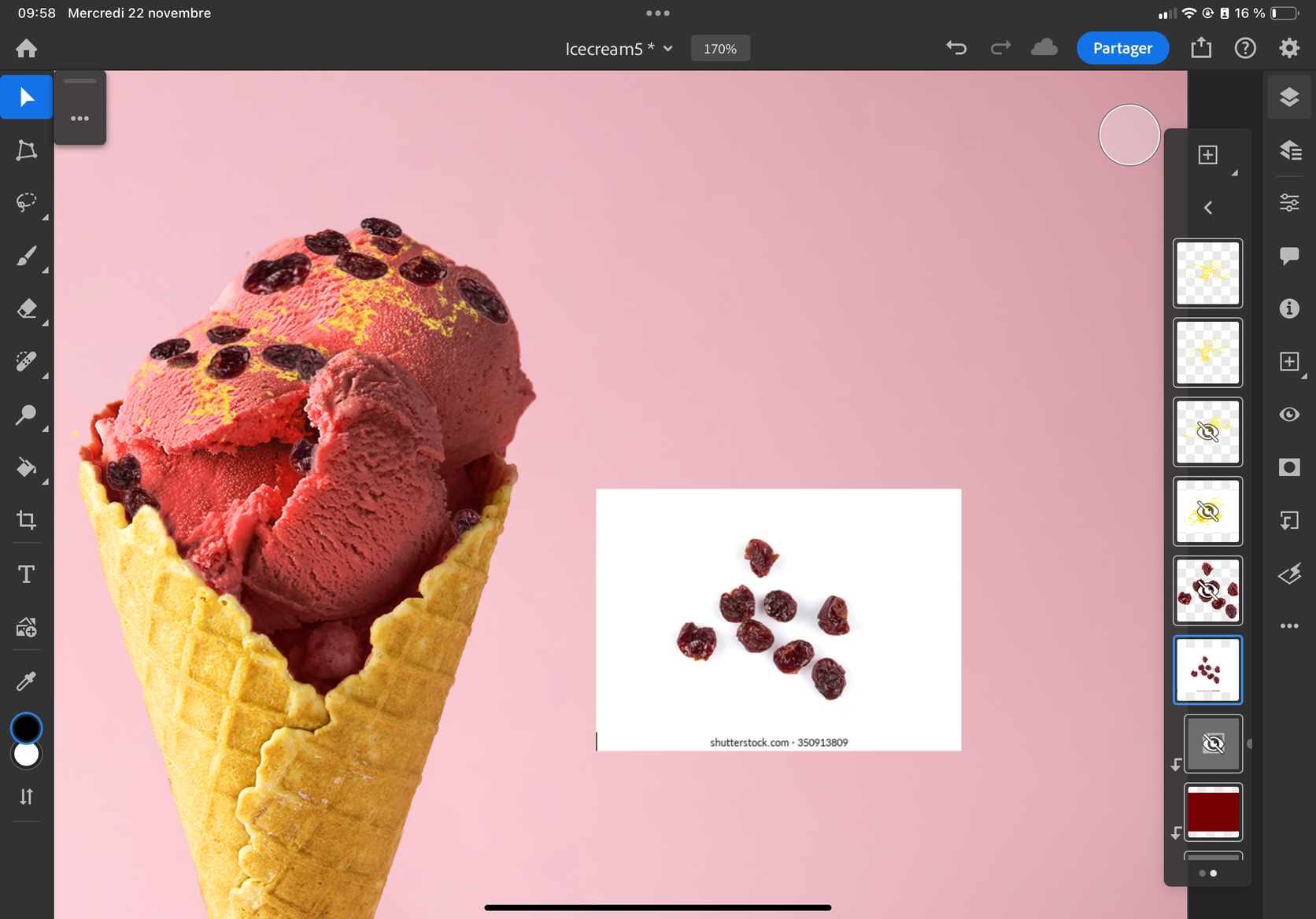
+
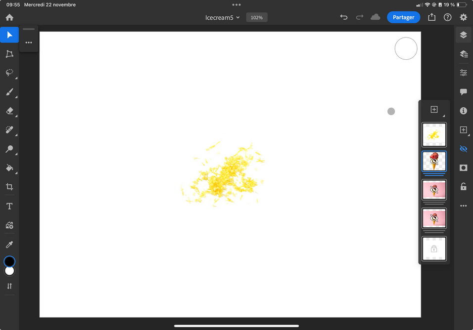
=
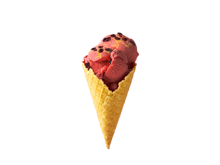
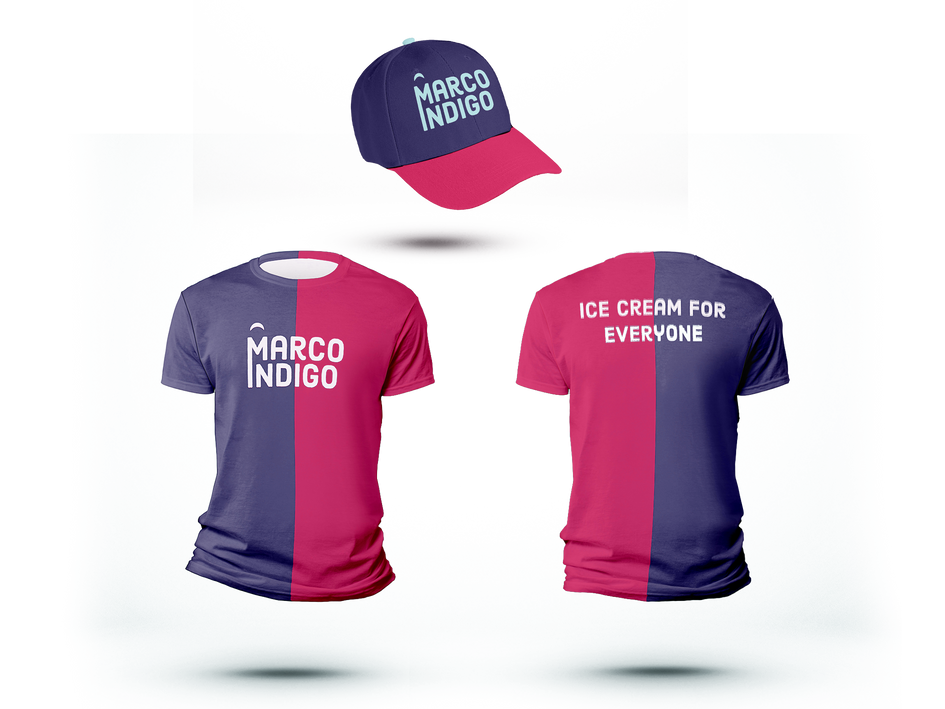
Employee Uniform Design
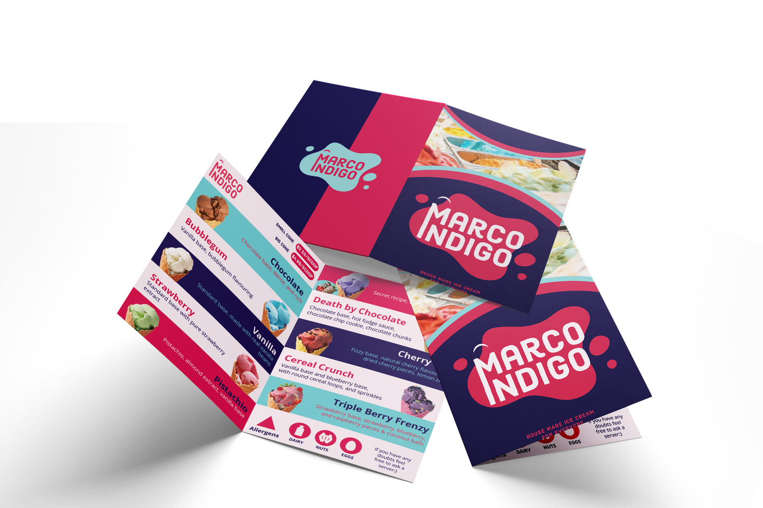
Menu Design

Crystalline Rose
Graphic Design
Artwork Design for a luxurious skincare brand who requested for a logo design, instagram template pack, label design and email design.
They wanted their brand to be feminine, soft, striking and luxurious.
They are an international beauty and cosmetics company that specializes in skincare product.
The brand's core values center around empowering women and challenging clichés and stereotypes in the beauty industry.
Our main logo contains the name of the company, the tag line, as well as the lettermark/monogram made of the brand's initals.
Typrography has been used to create the company logo because
it is simple, yet chic and elegant. Because it is a lettermark, just the inital can also be used on its own, especially in cases where the full name might be too long, whilst
still being easily identifyable with the company.
The secondary logo can be used for promotional material as well as for product packaging elements. The Crystalline Rose logo can exist in different colour variations based on the colour palette.
Primary Logo
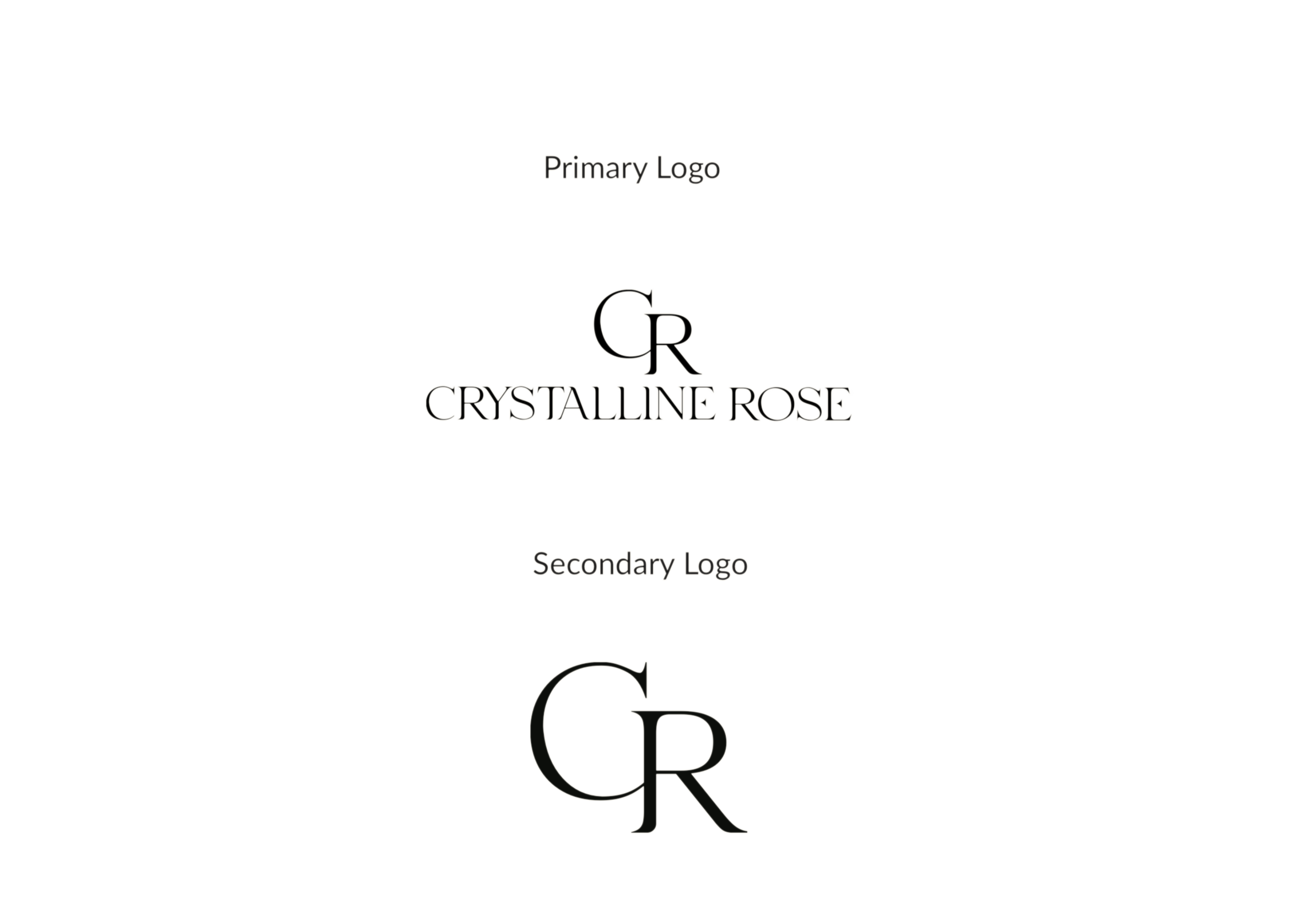

Secondary Logo
Colour Palette
This is a brand that reinforces the idea that every woman is naturally beautiful. As a result, a natural, earth tone colour palette has been used to reflect this.
Instagram Template Pack
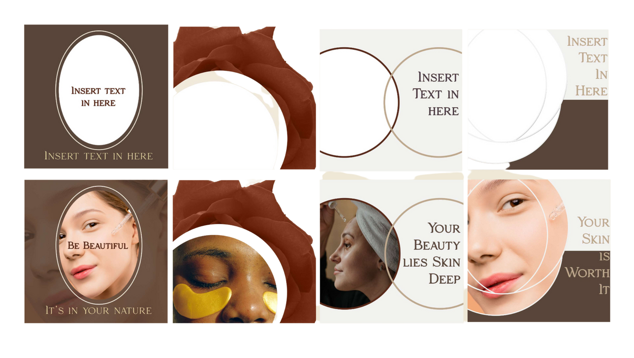
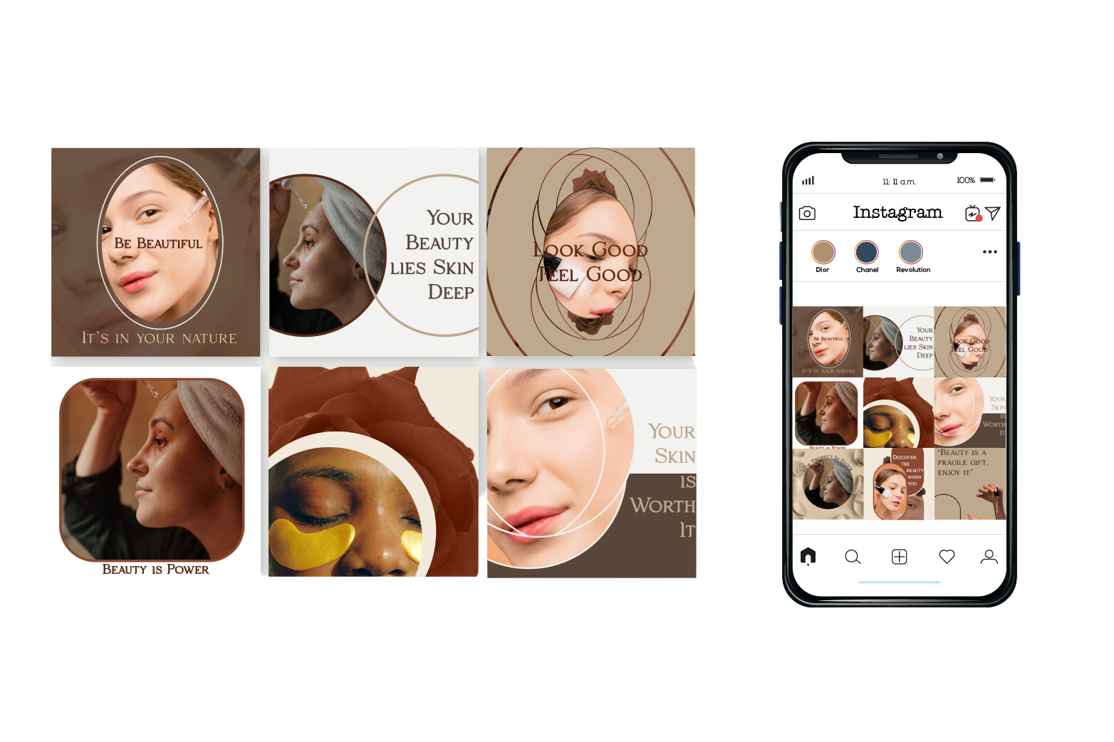
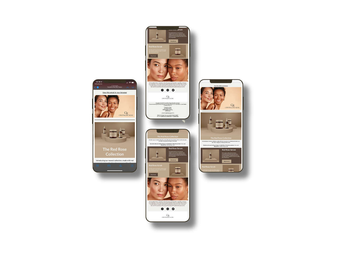
3D Mockups
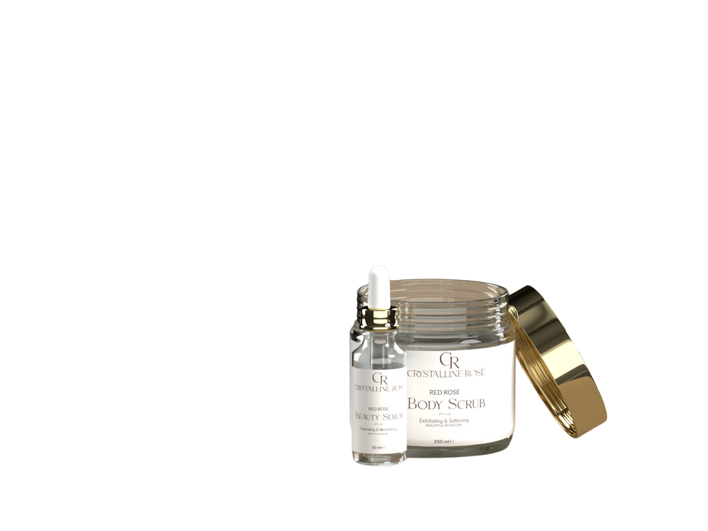
Crystalline Rose
UX Design
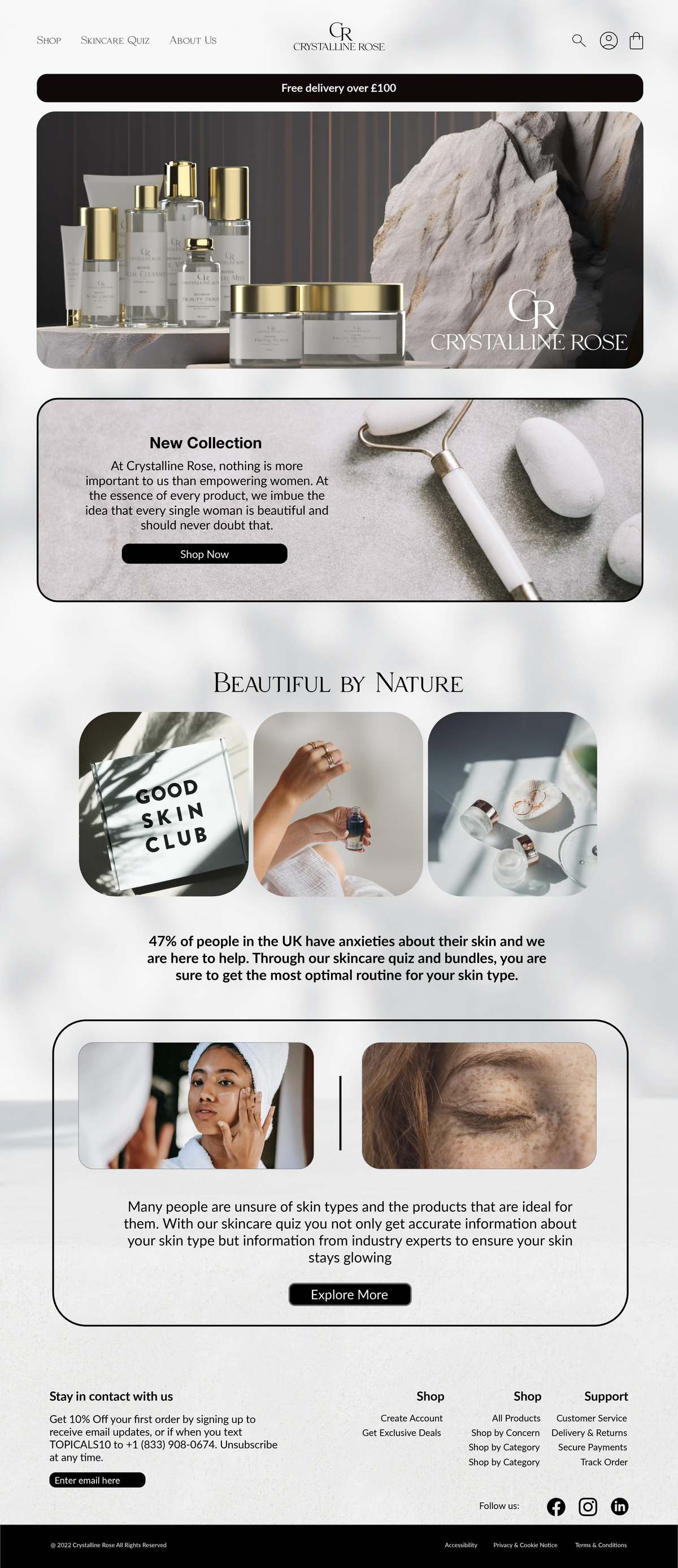
Responsive website for a luxurious women’s skincare brand. Key features include a skincare
quiz that will make product recommendations based on the results.
They wanted their brand to be feminine, soft, striking and luxurious.
They are an international beauty and cosmetics company that specializes in skincare product.
The brand's core values center around empowering women and challenging clichés and stereotypes in the beauty industry.
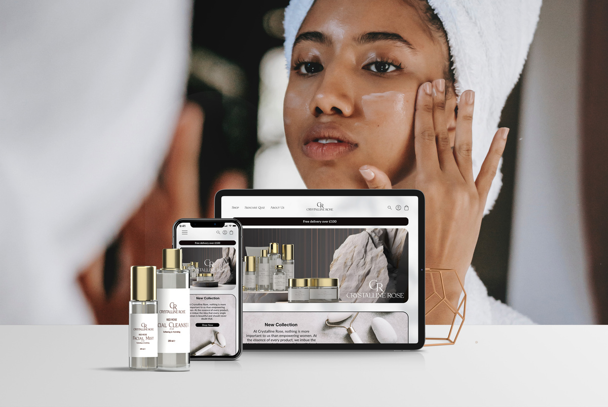

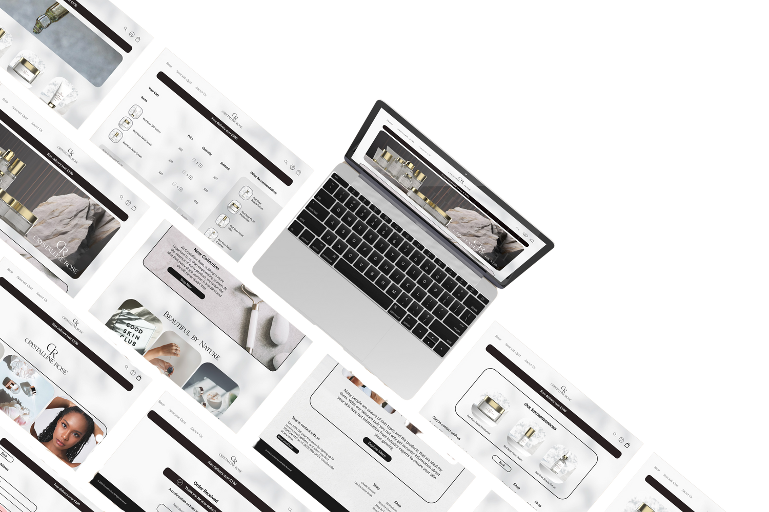
Crystalline Rose is an international beauty and cosmetics company that specializes in skincare product. The brand's core values center around empowering women and challenging clichés and stereotypes in the beauty industry. Crystalline Rose aims to provide products that cater to women aged 16 to 50, helping them feel confident and beautiful while embracing their unique individuality.
Problem
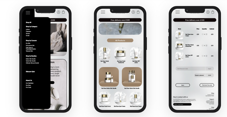
Finding a balance between conveying femininity through non-stereotypical colours and design elements that are soft, gentle, and light, and ensuring that the website design feels high-end and appealing to its users, whilst adopting a seamless user flow that informs users about company products and allows them make purchases on the site.
Solution
To create a user experience that aligns with the brand's message of empowering women to feel beautiful and confident while maintaining a distinct and luxurious visual style that sets them apart from typical beauty brands. Key features will in also include access to the products page from all website pages and a skincare test for users to identify the best product for them.
Sketches
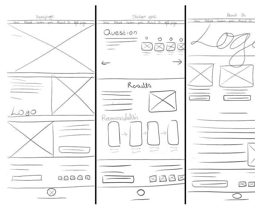
I began the design process with low-fidelity sketches and wireframes to accelerate decision-making through visualization without losing time. My sketches were based on the initial surveys and the business goal.
- These sketches shown in the image on the right were created for the desktop version of the site
- Various versions of these sketches were created before these 3 layouts were decided on
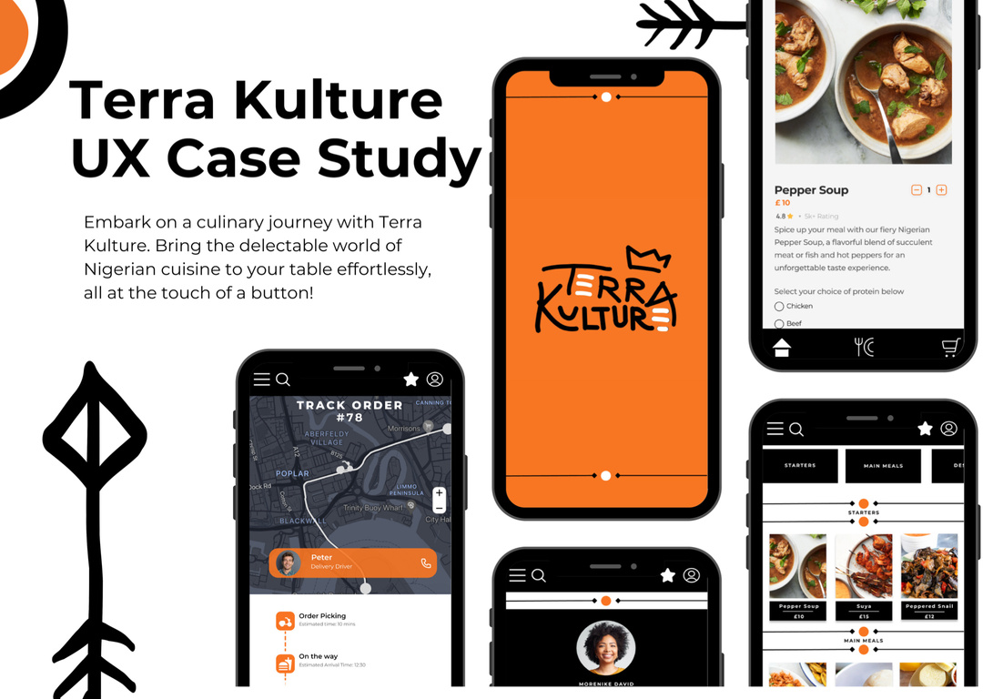
Terra Kulture
UX Design
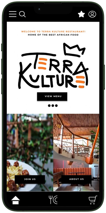
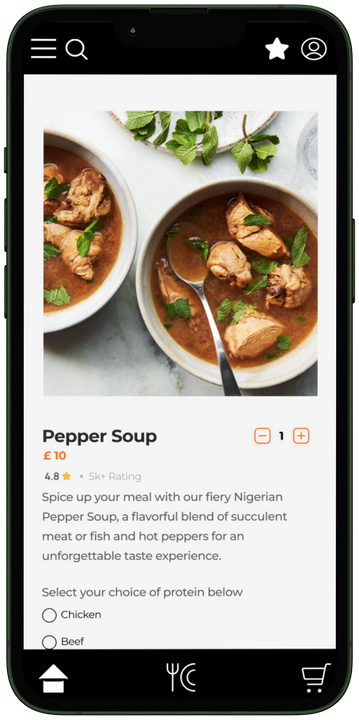
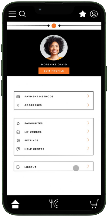
Mobile app ux design for a Nigerian restaurant. The specifications included a customisation option for orders as well as easy navigation
Project Overview
About:
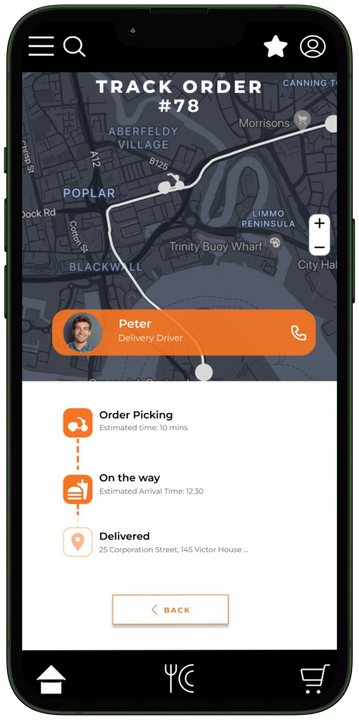
Terra Kulture is a Nigerian food delivery app that was created to offers a seamless and convenient way for users to order delicious traditional meals and drinks. The app is designed with a focus on meal customisation, and it also features easy ordering and real-time order tracking to provide a seamless experience for users.
Solution:
The Terra Kulture mobile ordering app seeks to resolve this issue by providing swift and accessible access to a diverse range of homemade Nigerian dishes, complete with doorstep delivery, convenient pickups, meal personalisation, food preparation and delivery updates, as well as the option to specify a delivery time and day. Consequently, our app aims to ensure absolute customer satisfaction in food delivery.
Problem:
In the hustle and bustle of today's fast-paced lifestyle, many Nigerians and individuals who like Nigerian food struggle to find time to cook or to find restaurants that make and deliver home cooked Nigerian meals on demand, with timely delivery and to their liking.
Understanding the user and their pain points
Population of Nigerian students in UK rose by 64% in one year
71% of consumers expect companies to deliver personalized interactions, and 61% get frustrated when it doesn’t happen.
60% of users want their orders delivered within three hours of making a purchase.
Half of consumers blame negative delivery experiences on poor communication
90% of Consumers Want to Track Their Delivery Orders
Around 93% of costumers want regular updates about their order
1
Inability to
schedule delivery
There are many restaurants that allow for scheduled delivery
Order modification unavailabIlity
Few mobile ordering apps have a feature that allow for order modifications
3
Lack of
delivery updates
Not many mobile apps give real time updates on the status of orders
User Flow
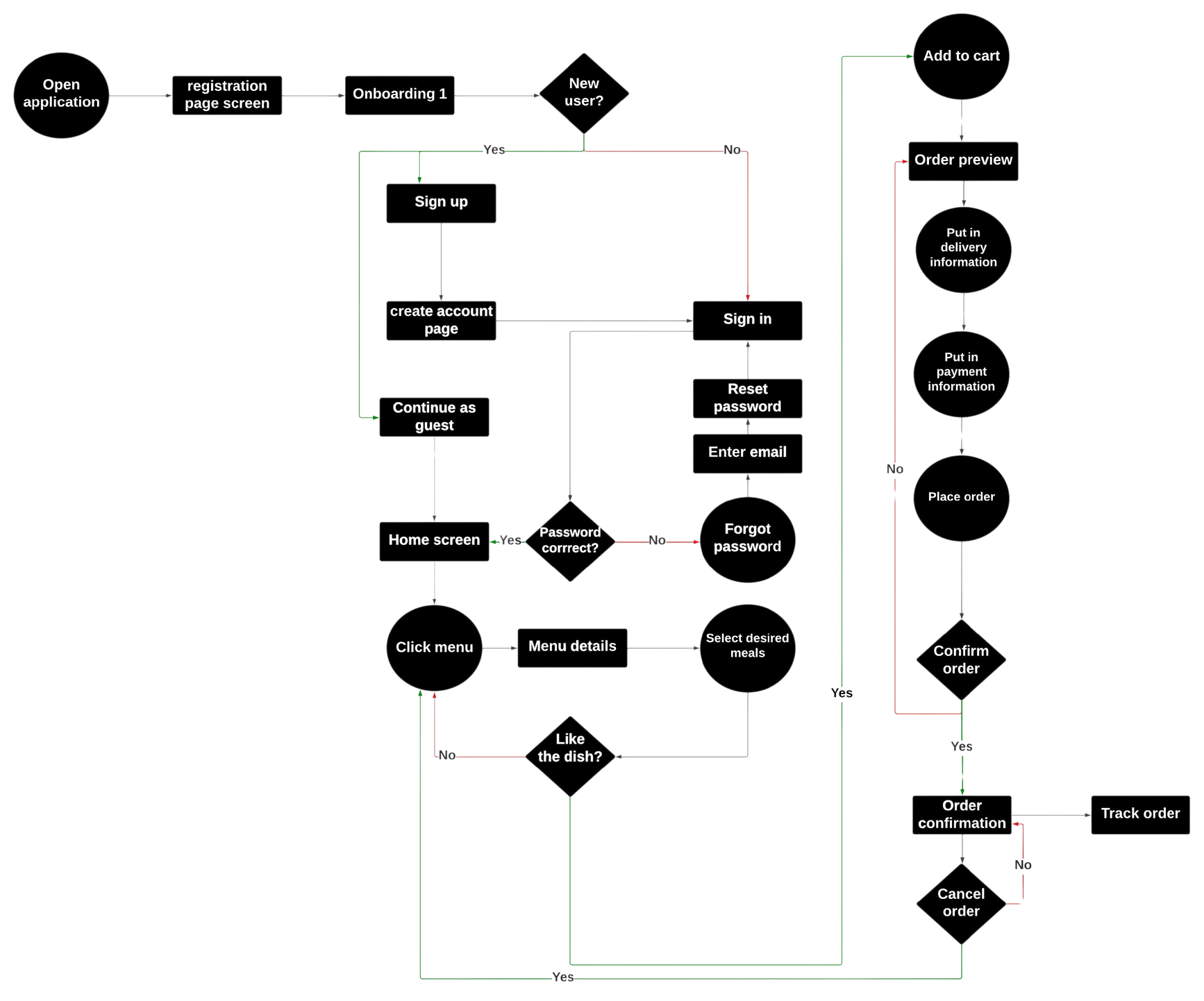

More than 1 user flow was created to determine the most ideal one that would allow users complete an order and sign up succesfully
Usability Testing Feedback & Implementation
5/5 users stated that they preferred a grided view with the focus on the images
4/5 users stated that would like to have a sticky bottom navigation bar so they don’t have to scroll to the bottom to get to those pages
1 user (a restaurant employee) mentioned that having options to choose from would be easier and faster for the restaurant when taking orders
Usability Testing Feedback 2 & Implementation
5/5 users stated that they had difficulty scrolling through the rectangle to get the appropriate date and time. A calendar feature thus makes this process easier
4/5 users stated that would like to have the map feature to be able to track their delivery driver in real time and contact them if necessary
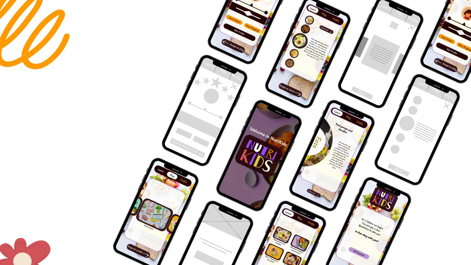
NutriKids
UX DESIGN
Responsive mobile and web
app design for a site that teaches kids about nutrition in a fun and engaging way
NutiKids is a website and app for social good, that teaches kids between age 5-11 about Nutrition so that they begin to understand why it is important to develop healthy habits from an early age
and do so themselves.
The Problem
How do I create a website that would help parents teach their kids about nutrition help them develop good eating habits from a young age?
The Goal
Developing an app and website that would be informative enough to teach young kids about nutrition at a basic level in a way that would appeal to them and be fun for them
Insights from research
41% of parentshave abandoned attempting to get greens into kids’ diets
Some toddlers need to be offered a new food up to 10 – 14 times before they try it
64% of parents admit they struggle to get their children to eat vegetables.
60% of parents feel like poor parents because their children won't eat the vegetables in family meals,
Low - Fidelity Wireframes
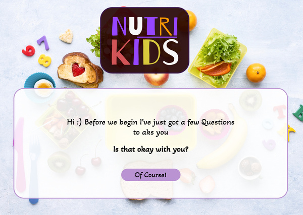
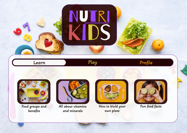
I decided to go for a mobile first design due to the fact that kids anre introduced to mobile devices before desktops or tablets. Each page has something for users to do, whether it is scrolling through options and making selections. So this way the children this app is targeted at stay engaged with the product
High - Fidelity Wireframes
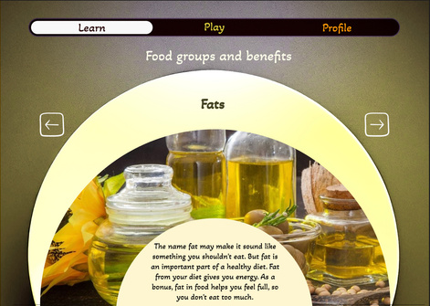
Changes from usability findings
Swipe dow interaction
Feedback showed that this interaction interfered with the swipe lift interaction at the bottom.
Drag to next food group interaction
Feedback showed that the animation that accompanied this interaction was not seamless.
Swipe right interaction
Feedback showed that this interaction interfered with the swipe lift interaction at the bottom.
Section Title
Feedback shows that users will like to stay aware of what page they are on so a title would be useful on every page.
Circular slider
A circular slider was chosen to replace the previous one as it results in a more seamless animation.
Swipe down interaction
Only this animation is in place now, so to go the the play or profile section, users will have to tap on it.
Progressive Advancement Modifications



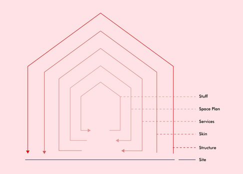
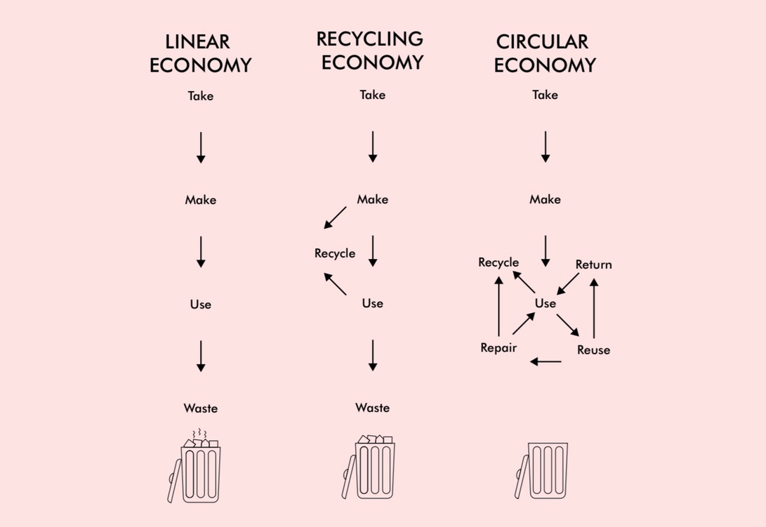
Infographics
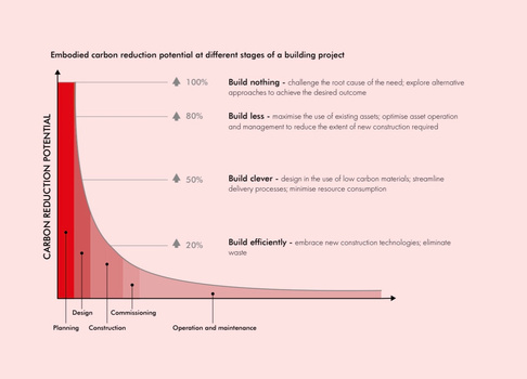
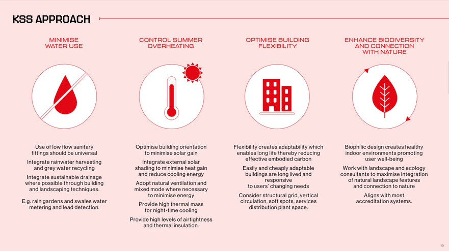
Poster Designs
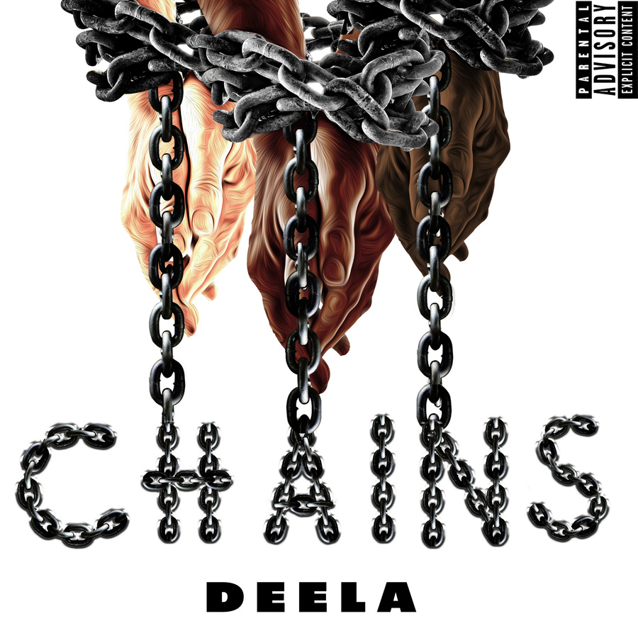
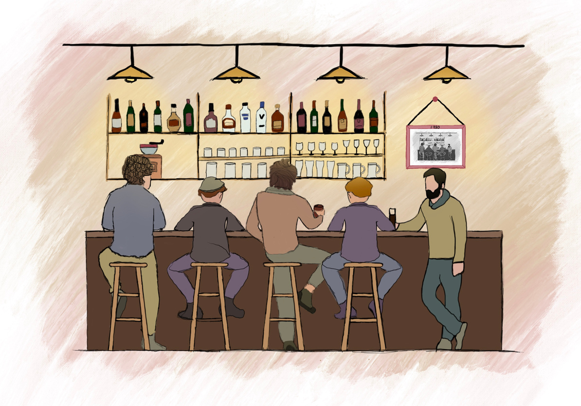
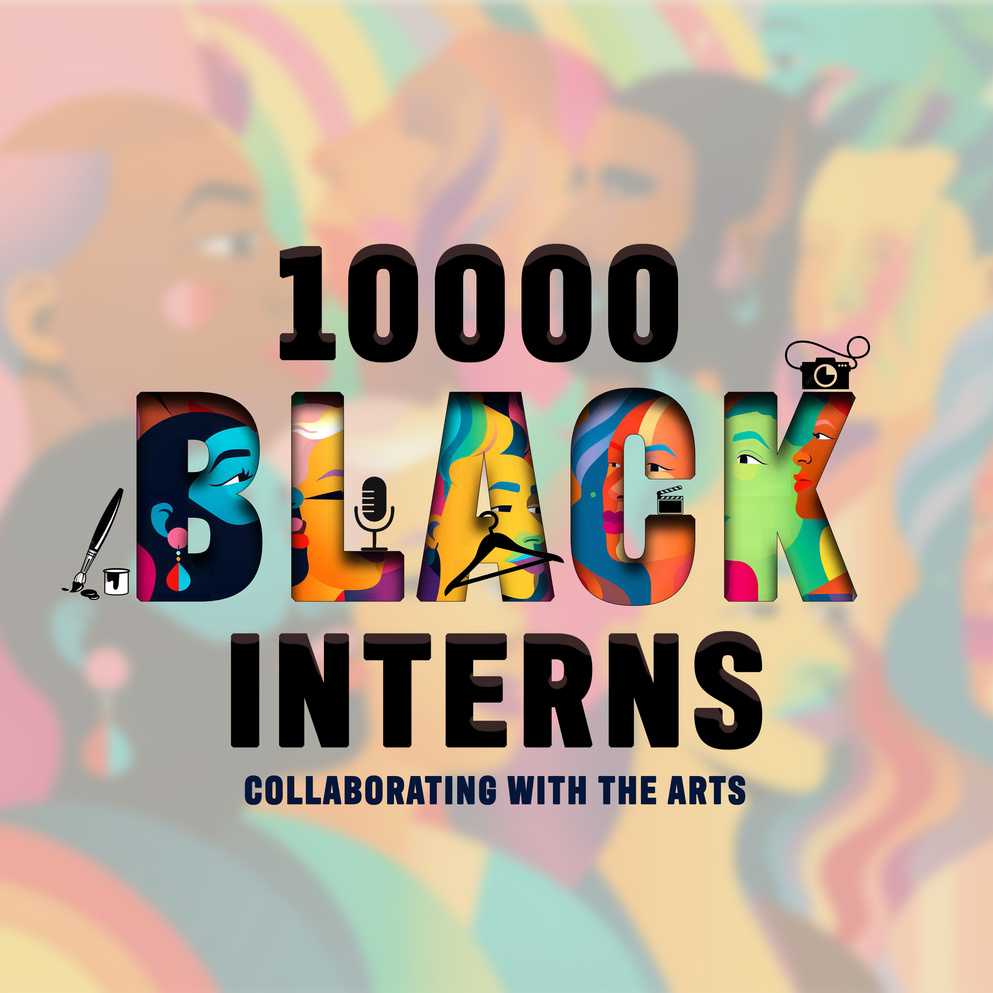
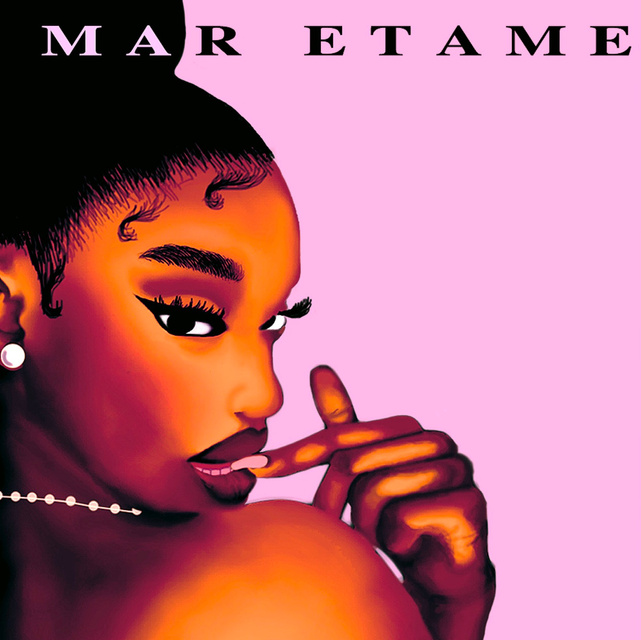
Photo Editing
Instagram Template Design
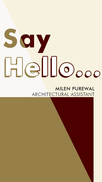

work
with me

Address
14 Rope Terrace, London
phone
(44) 7464796959
e-mail
Tomiioduwole@gmail.com
